

We love this gorgeous packaging for Stork Club whiskey. Editienne created the design, which features elegant typography and beautiful gradients.
“Rye whiskey from Germany? Well that certainly is extraordinary albeit the rich German history for distilling rye grain! The ‘extraordinary’ was prime motivation for the Stork Club packaging.”


“The Spreewoods where Stork Club is produced is a historic cultural landscape. The protected landscape is shaped by its wetlands and moors that provide a distinct and ideal climate for cask-ageing. The biosphere is home to a wild abundance of animals, birds and insects although it is only a mere 60 km south of Berlin.
For the packaging we decided to choose the stork as the hero because the Spreewoods are home to an impressive population of storks. Each village seems to have at least 5 of their own nests. To give the stork a more dynamic strength we decided to display him with his wings spread, capturing him the moment before he lands in his nest.”

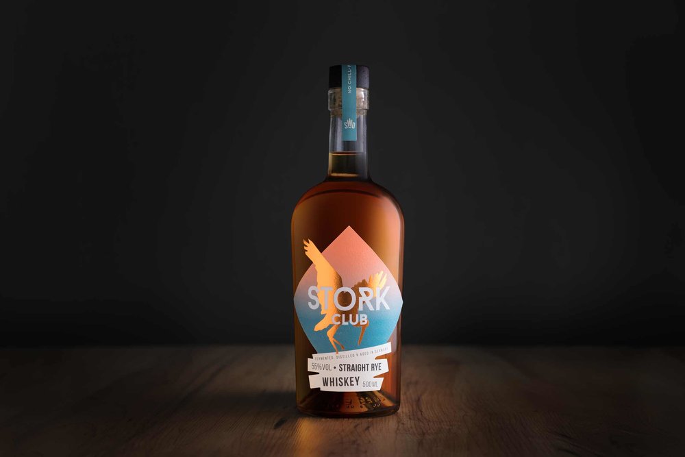
“The bottle was chosen for its simple yet elegant and extraordinary line. It is not a bottle commonly used in the whisky-world which underlines our different approach. We also wilfully relinquished the ‘Retro’ and ‘Heritage’ styled whisky packaging as well as their oscillated curves. A modern typography was extremely important to us. Through the use of extraordinary materials and techniques we nonetheless communicate the premium approach of the product. The paper ‘Pure Cotton’ that was used for the label is a heavy natural paper with a smooth and fibre-rich feel that lets the colours used for the print glow.
The color gradient of the label resembles the impressive sun rises and sun sets in the Spreewoods. Through the color gradient the copper embossing of the stork really stands out.”

“For the impact on the target audience we wanted to stand out from the crowd without being obnoxious, symbolizing a new approach to German craft whisky.”

Agency: Editienne – Kommunikationsdesign
Designer/Art Director: Christine Gundelach
Client: Spreewood Distillers
Printer/Manufacturer: GEWA-Etiketten
Location: Berlin, Germany


