
By: Julie Wolfson
Tony Auston of Auston Design Group shares his advice for translating the essence of a wine into a unique visual story on every bottle.
The dinner party invitation has arrived. No need to cook. Then the request follows: “Just bring a bottle of wine.”
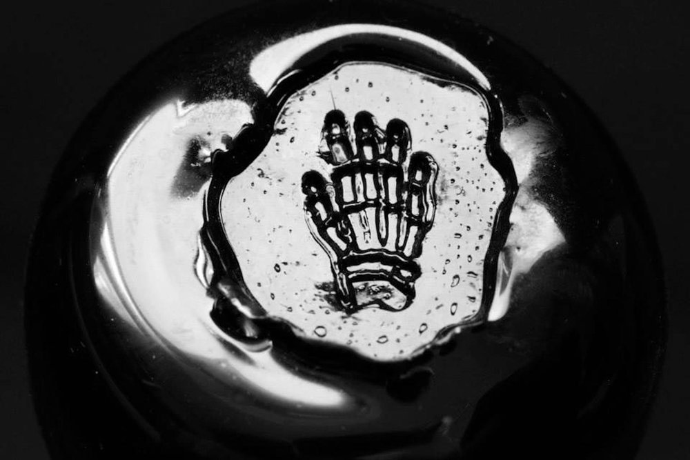
Walking down the aisle of the wine shop, the shapes and colors indicate some details about what’s inside each bottle. Most of the green bottles of red wine in the French Bordeaux aisle have historic names on the label, classic typography and images of wineries, wine caves, and family crests. There are the labels featuring fine artists like Stefan G. Bucher’s stretching hand on all of the Habit Wine bottles. Some designs are austere, free of imagery with clean lettering for the name like the classic Flowers Pinot Noir or hand-drawn lettering like the Melville Syrah.
Beyond these examples wine labels come in all shapes and sizes. When approaching wine label design, it can be a challenge for designers to decide where to begin. And when a winemaker is ready to brand or rebrand their bottles, many questions emerge—What story do we want to tell our customers? What do we want the bottles to look like and what information needs to be on there? Do we want to convey tradition or a more contemporary spirit, or is it somewhere in between?
This is the point when many winemakers and winery directors call Tony Auston of Auston Design Group in the San Francisco Bay Area. Auston’s long career developing successful branding, rebranding, and design for wineries, has made him a sought after source in the wine community. His work has earned design awards and helped several wine companies dramatically increase their sales.
As a young designer in San Francisco, Auston toiled away in the tech sector. A move to Ireland to follow a love interest led to an eventual move back to SF in time to have a baby. Upon becoming a father, Auston discovered that he felt strongly about not wanting to raise a child in the city. He found a job in St. Helena, the heart of the Napa Valley wine country, for a company that specialized in wine packaging and branding. He worked for 6 years as the design director at Colonna Farrell. Living in St. Helena gave him the opportunity to immerse himself in the culture of the famous wine region.

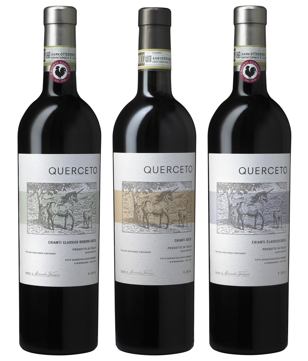
First things first: Auston always wants to tell a story. From scientific illustration to typography, historic documents to Venn diagrams, Auston finds inspiration everywhere when creating wine label designs. Sometimes the idea comes from delving into the name of the wine, like Synthesis for Martin Ray Winery, and creating a red wine tinted Venn diagram of an abstracted bunch of grapes. He also had some fun with Italian Chianti makers who have a unicorn in their family coat-of-arms. For Querceto he included the oak forest at the winery and a subtly provocative deer next to a unicorn. Pale color bands help distinguish the three types of Chianti they produce, making them easy to differentiate on the shelf in a wine shop.
As a designer, Auston calls himself a creative problem solver. Here he shares some of his considerable experience in this category from meeting with the client to finalizing the designs.


Getting Started
Learning about wine is important…and fun
For Auston, understanding the history of wine packaging is of utmost importance. “It is really easy to make a cool graphic design that you and your friends think is awesome, but the wine consumer may not understand why it does not have all of the usual visual wine cues,” he explains. “It does not mean that is has to be traditional, but there is a certain informational way to present it that is part of wine culture. Even if you are going to break the rules, you need to understand the rules before you break them.” Studying wine culture means understanding the winemaking process, knowing the differences between growing regions and wine styles, touring wineries, and yes, wine tasting helps too.

Branding and Rebranding
The magic is in the details
Auston knows that every brand has a unique story. The designer’s job is to uncover the story and solve the problem of how to present it to the world. Whether it is lower or medium priced wines that are going to be sold in chain stores or hand sell wines that are in restaurants and fine wine stores, Auston knows that the magic is in the details. “When there is no story we just become decorators and not designers,” he explains. “We work with our clients to figure out what makes them different from their competitors; their unique story. Often they have it very well defined when they come to us, which makes our job a lot easier.”
Rebranding clients come to Auston Design Group when they know it is time for a new look. What that new look will be depends on what the winery’s goals and aspirations are for the brand. “We really rely on our clients to provide us with a well thought out marketing brief. Do they want to increase the perceived value of the brand, so they can charge a little more? Or is it because sales are flat and we need to look for a way to increase the shelf presence, and encourage trial?”
Auston starts by interviewing the client, which can be the winery owner, winemaker, the brand manager or director. He wants to learn the history of the product and the brand and how they got to where they are at the current time. From there he looks at competitive set products to determine how best to fit into that specific category and price point, while at the same time stand out against the competition.
Auston starts by interviewing the client, which can be the winery owner, winemaker, the brand manager or director. He wants to learn the history of the product and the brand and how they got to where they are at the current time. From there he looks at competitive set products to determine how best to fit into that specific category and price point, while at the same time stand out against the competition.


For Lava Cap, Auston helped the winery reimagine the bird mascot. “They had a silhouette icon of a Stellar Jay. It was part of their identity that was lost with their previous redesign. They have a lot of loyal customers. Many of whom had become fond of the Stellar Jay icon and missed seeing it on the label,” explains Auston. “With their redesign, it was time to get a bird back on the label.” Auston wanted to have a visual with a strong sense of place. They chose to represent the ever-present Stellar Jay population living around the winery by using an antique scientific illustration from the mid-1800s. It is from part of a private collection they were happy to be allowed to use.
The Search for Visual Inspiration
Start with the people and the place
In the beginning, Auston suggests interviewing the key people and whenever possible visiting the winery. “We usually visit the site before we even know if we have the job. It helps us think about how we want to present ourselves and our process to the account. We want to get a good understanding of the essence of the winery and what the experience is like for people who visit it.” Though every design that comes out of Auston Design Group has been customized for the client, a few common threads emerge: a strong attention to detail, enhancing the look with paper texture, and a carefully crafted visual story.
As with finding the right scientific drawing for Lava Cap, Auston was searching for a visual representation for the Dry Creek Vineyard, Old Vine Zinfandel. “The brand imagery of Dry Creek Vineyard’s line of wines is based on pre-World War 2 America’s Cup wooden racing yachts – J-boats. For the Old Vine Zin we wanted to stay true to the era. The design was inspired by an historic steamship ticket from the 1920’s. We call these busy types of designs “wine geek” labels. Ones with a lot of technical winemaking and growing information on them.””

Start With the Bottle
Learn the varietals and which bottles they traditionally are bottled in
Auston includes bottle research and suggestion as part of his process, but often the bottle shape and color are given to the designer with the project. The shape and color of the bottle are generally dictated by tradition and the varietal. In wine, there is not as much wiggle room like there is in spirits. The most well known wines in the U.S. are Chardonnay and Cabernet Sauvignon. Their origins are from two famous wine regions in France, Burgundy and Bordeaux. Each of these regions has a unique bottle shape, the ones we’ve become accustomed to when we purchase a cab or a chardonnay. Historically, whatever the varietal, if a wine is from one of these regions it will be bottled in the bottle shape of the region. This tradition probably came about hundreds of years ago due to the regional proximity of the bottle-maker to the area where wine was being made.
One exception to this rule: zinfandel. Check out the zinfandel aisle at a wine shop to see the variety of ways it is bottled and presented. “There are no rules for zinfandel, because it is not a European heritage brand. It is distinctly American” explains Auston. “If you look at your grocery’s zinfandel aisle section, you’ll see that they are usually the most fun and experimental labels on the shelf. Historically they have been. We were able to go nuts on this one and put all kinds of geeky information on there.”

Printed on Neenah Classic Felt
The Label Design Process
The visual story coming to life
At Auston Design Group they usually start with brainstorming and sketching as a prelude to working out initial design concepts. From very traditional, to contemporary, to wacky and weird, the possibilities are wide open and infinite when it comes to wine label designs. That comes back to the fact that every brand has something unique only to itself. It’s not always easy to find… “we once had a project that had absolutely no story” said Auston, “then over conversation with the owner it came out that his friends had a nick name for him — Jiminy, as in the cricket. We latched onto it, and a little gold foiled cricket emerged and became the icon for the brand. People loved it.”
“As with Zinfandel, these days people are way more experimental with wine packaging in general. Wine is such a crowded category that wineries have become much more accepting of thinking outside of the traditional norms.”

Printed on Neenah Classic Felt
That being said Auston understands that wine can still be a traditional product category. “There are only so many shapes out there that can work and if you try too hard it does not always work.” The Bogle label that he designed is about it have its 20th anniversary. A rare feat since most labels in this category get redesigned every few of years. Auston attributes the longevity of that design to the shape of the label, and its classic, traditional visual wine cues.

Brand Story Case Study: How Phantom Came to Life
“There’s a cool story behind this Bogle Vineyards brand. Cool, but sad, too. Their family has endured far too many premature deaths,” says Auston. “The three siblings who run the winery today all inherited the reins in their early twenties. Their grandfather, father, and mother, all instrumental in building the company, passed at early ages.”
“Even before their parents passed, there were many accountings of unexplained things happening in and around the cellars of the winery, particularly when someone found themselves alone at night. Sounds of footsteps, shadows out of the corner of one’s eye…the usual paranormal stuff. Most folks assumed it was the founder and grandfather, Warren, watching over his life’s work.”
This story led to the idea of creating a brand called Phantom, that and the fact that the family name is the literal Scottish translation of Bogeyman.
Auston explored many directions of spooky, but considered many were too literal, or Halloween-like, or goofy. “The original wine was a blend of old vine petite sirah, old vine zinfandel, and mourvedre. With the majority of the vines being old vine, it became apparent that they could somehow become ‘the Phantom’. We worked with photographer Avis Mandel, of Napa Valley, to come up with just the right image of gnarled, twisted, spooky old vines to represent the brand. With a great final photograph we knew we should keep it simple and let the image do the work. A poorly handwritten brandmark (phantoms do not have good penmanship), a simple seal to show Bogle as proprietors, subtle use of muted colors, and the tagline ‘a hauntingly seductive red wine blend’ combined to create a thought inspiring, striking image for the brand.”
Choosing the Best Paper Stock
The texture helps tell the story
Auston likes to work with uncoated paper stock for its artful, elegant, and tactile quality. The natural look and feel works well for wine. “When you go to the grocery store it is pretty rare to see a wine label on coated stock. It tends to make things feel a little too slick and corporate,” not exactly what you want if you are trying to sell wine” says Auston. “It’s not a rule, just a generalization, but most of the time you will find labels with coated stocks on the bottom shelf where the lower priced wines live. It’s more of a mass-brand look…even though we deal with mass-brands a lot, we want to present them as though they are a small boutique winery.”
The paper Auston uses the most is Neenah’s Estate No. 8. “It receives ink very well, and has a nice touch to it,” he says. It takes embossing and debossing really well. Through printing and finishing techniques, we can turn that paper into just about anything that we want visually. A lot of the labels you see on our website look like they are handmade papers or old parchment papers. Those are all printed on Estate No. 8. We print the texture and emboss or deboss it to make it look like a different kind of paper.”
In the case of Phantom, Auston knew just the right paper would help him pull off the design. “This was the perfect design for an uncoated paper stock like Neenah’s Estate No. 8. A gloss or semi-gloss could not begin to help evoke the moody eeriness of gnarled vines in winter’s matte twilight hues. No. 8 has a great ink holdout for better control on press, and fantastic tooth that refracts light well to aid in its soft matte qualities.”
For added protection against moisture, Auston specifies stocks with laminated moisture barriers. This further boosts the wet strength ability of the paper to stand up to the travels from cool to warm temperatures, like refrigerators and ice buckets, to being served. He also suggests that understanding embossing and debossing in those high moisture situations really make a difference when communicating with the printer. “If you have a textural background emboss it is important to taper that emboss off away from the edges of the label ⅛ to a ¼ of an inch. If you don’t, it creates a little tunnel on the edge of the paper lets moisture get behind the label, which causes bubbling.”

Let’s Talk About Printing
Make the printer your friend
Auston recommends learning the history of how printing presses work and what is possible. He provides the printer detailed print specification call outs. “It is like a blueprint for a contractor to build a house, but it is a blueprint for the printer to understand what the design architect is trying to achieve. It is the main communication device between designer and printer.” Printers have remarked that they appreciate the detailed spec sheets they receive from Auston Design Group. “They complain that many designers give them digital files with no call outs. Then they just have to figure it out and build the files themselves, which can often end with undesired results.” Knowing how to build a precise and exact mechanical art file, and a detailed print specification call out for the printer insures the best results. Auston also encouraged designers to have a pre-production meeting with the printer to discuss the job.
“A lot of designers are very forthright with the printers and demand that something be done in a particular way, which may be fine, but it’s in the designer’s best interest to work with the printer to determine the best approach to get to a desired result. It is often the younger designer that gets a little demanding with the printers. I can say that, because I know I was that way,” admits Auston. “but that’s not to say that being a little forthright ways to achieve and effect didn’t lead to a new printing technique that hadn’t been done before.” Having said that, be open to discussion and suggestions from the printer, they know what their equipment is capable of and may have ideas to make the label a little bit better.”
For added protection against moisture, Auston specifies stocks with laminated moisture barriers. This further boosts the wet strength ability of the paper to stand up to the travels from cool to warm temperatures, like refrigerators and ice buckets, to being served. He also suggests that understanding embossing and debossing in those high moisture situations really make a difference when communicating with the printer. “If you have a textural background emboss it is important to taper that emboss off away from the edges of the label and ⅛ to a ¼ of an inch. If you don’t, it creates a little tunnel on the edge of the paper let’s moisture get behind the label, which causes bubbling.” He feels that working with talented and experienced printers makes all the difference in a project going well and not running into issues.


There are Some Rules to Follow
Now let’s talk about those pesky government laws for wine labeling
When you design as much wine packaging as Auston Design Group you have the many rules for wine labels memorized. For example:
- The brand mark needs to be displayed prominently on the front label at 2mm, or taller.
- The varietal and the appellation are supposed to be in conjunction with each other on the front label and can be no smaller than 2mm Cap-height or x-height.
- The alcohol statement, can be no smaller than 1mm and no larger than 3mm, they don’t want you hiding it or promoting it. It can be on the front or the back label.
- Most standard wine bottles have 750ml blown into the glass, usually on the side towards the bottom. If it is not in the glass, it needs to be stated on the label no smaller than 2mm, and that can be front or back.
- Also on the front or back you need to have the “produced and bottled by statement”. It must be a minimum of 2mm and has to say, for example, produced and bottled by Acme Winery, Napa, California.
- You also are required to have ‘contains sulfites’ at 2mm on all wine products, because some people have sulfite allergies.
- And the government warning, which has required language regarding alcohol consumption and pregnancy, operating machinery, and its relation to certain health issues. This can be no smaller than 2mm cap or x-height, and no more than 26 characters and spaces per linear inch, and surrounded with a clear space of 2mm from other graphic elements on the label.

Learning the traditions, following the rules, breaking some when the time is right, and telling a visual story of the wine will help make each bottle of vino stand out on the shelf (and more likely to get picked up and taken to that dinner party). Each bottle can tell a story from the wine inside the bottle to the label that can offer insight into the flavor of the wine, the world of the winemaker, and beauty of the winery. Pick up the bottle. Feel the texture of the label. Read the story in words and images. Then pop the cork and enjoy.
Julie Wolfson
Julie is a freelance writer. She spends her time exploring the creative process. From artists, designers, and entrepreneurs, to whisky distillers, coffee roasters, farmers, chefs, and musicians, she focuses on stories of determination, innovation, and ingenuity. Her writing has been published in the Los Angeles Times, HOW Magazine, Angeleno, The Henry Ford Museum Magazine, Cool Hunting, The Bold Italic, KCET, AOL Travel, and Gothamist and many other food, design, and lifestyle publications.


