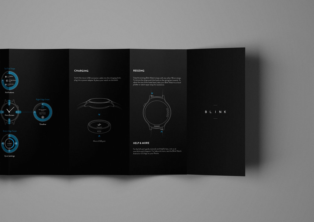
“You don’t wear a watch because you just want to see time. You wear a watch because it represents who you are and that sensibility had to be conveyed in a very delightful experience.” Indeed—and who says that delightful experience is only in the product itself? Blink Watch aims to give consumers joy from the very second they have the box in their hands. We spoke to Nikhil Bapna, Mani Singh, and Ishaan Dass who collaborated together on this project to learn more about how they developed this design.
What: Clever text-heavy packaging for a watch that feels equally sophisticated and playful.
How did the idea for word search-inspired packaging come about?
Blink Watch: I always believe that first impressions count. And the packaging was the first impression we’d be giving to the buyers. We wanted to create a strong first impression which would make it memorable and shareable, so it was crucial to invest in a type of packaging that’ll engage and provoke curiosity to encourage customer consideration.
Ultimately, they would understand Blink by what they get to experience before the product itself. We wanted to present our outlook as fresh and fearless, and construct a unique visual experience to complement the redefined experience of the watch. We thought of crafting the journey from unboxing to the very experience with the device in a very indulging process. This is where the concept of word search came. It would lead the users into a state of flow to achieve the feeling of being completely absorbed in what they are doing. It is something which embraces the simplicity of our brand and more importantly, the product.
The smartwatch market is booming. How did you go about research before designing? What did you take into consideration, and how did you pave your own way?
Blink Watch: We believe that people don’t buy products, they buy stories. We didn’t want our story to be focused around our product at all, but more what it evokes in the user; how does it make them feel; how will it persuade and influence them. Our aim was to give meaning to our brand and making it authentic. Hence, re-inventing and re-imagining become our storyline. We believe that every process, every interaction should be as natural and humane as possible, which would make the entire experience delightful. This forms the genesis of our brand story. And hence the entire aesthetics of it, the messaging, the design language had to be in sync with our core values, i.e. keeping things simple, meaningful and delightful.

In the word search, there are certain words that are just slightly more noticeable. Why did you choose these words to include?
Blink Watch: After experimenting with the concept and execution, we found ourselves a little left of centre with the approach. It was at this point where we want to lead the buyers into our brand’s deeper delight and guide their eye around the design. In order to make the process more noticeable, visual hierarchy was a crucial element in the design and an even more important one when it came to grabbing people’s attention.
Since the eye is nearly always drawn to what it can easily perceive, some words which form the basis of our brand ethos were deliberately highlighted more than others. So, in order to seek balance between the product messaging and visual aesthetics, it was an attempt to make the process more predictable and focussed on the customers.

As a design that incorporates a text into the packaging, how did you decide on the fonts used?
Blink Watch: Since the entire experience relied on letters, the typography was crucial here. And as it is said, fonts speak larger than words. They carry a lot of meaning and character in the way they look. Choosing the right font was a daunting task, because when it comes to communicating with type, both readability and legibility of the target segment needs to be catered.
Our brand philosophy revolves around simplicity, so we thought of exploring neo-grotesque fonts. These fonts give a sense of simplicity and practicality because of their uniform and modular nature. They have low stroke contrast and appears to be less mechanical than modern geometric fonts. And they are less irregular and eccentric than traditional grotesque fonts. Here we decided to use ‘HK Grotesk’ (Designed by Hanken Design Co.) with slight modifications in the cap-height to make it legible for small text while still preserving its personality.
The packaging is primarily black and white, with the tiniest color details on the front and in the user’s guide. Why did you choose to do this, and how did you decide on this color?
Blink Watch: Primarily, black and white is mostly associated with absence of colors. In our case, it’s the source of a new-imagined experience. It is this contrast that adds to the elegance and create a sense of completion.
The visual balance of black and white with an accent colour leads to a powerful messaging, creating a visual ‘pop.’ The addition of an accent colour to this minimalist colour scheme should resonate with our brand design intent.
After multiple iterations, we decided to use Teal which is highly associated with creativity and sensitivity. Adding subtle Teal accent to this scheme, also brings a versatility across our brand visuals. The right hue of teal was chosen that was soft and rightly muted with the powerful contrast of black and white.

How did you translate the device’s simplicity into the packaging?
Blink Watch: Making things simple is rarely a bad idea. But, that’s not to say that simplicity is easily achieved. This design has come about after multiple sessions of introspection of our own fundamental brand and design ethos by overcoming many complex challenges and at the same time carving a niche for yourself. As it is said that a product conveys simplicity in a two-pronged framework. One is the product design and other is the product messaging. With Blink, there is a lot more to it than what just meets the eye. We have gone about re-imagining the entire interaction for a smaller screen on the wrist. Hence, that should be reflected in our packaging as well. So, both our product story and design reflected this message of re-imagined experience.
The design is just as elegant as it is playful. How did you bring an element of delight and play into the packaging and still make it fitting for the brand?
Blink Watch: We wanted our audience to be excited about Blink. You don’t wear a watch because you just want to see time. You wear a watch because it represents who you are and that sensibility had to be conveyed in a very delightful experience. The packaging was our medium to convey the surface delight which would reveal our brand’s depth gracefully. By this medium of delight, we tried to imbue the product inside with a sense of brand mystique. Ultimately, this element of delight and play is the core of our watch user experience which we tried to convey across our entire brand visual expression.
Why we love it: Blink Watch successfully blurs the lines between something that’s upscale and something that’s lighthearted. Not only does the word search highlight values of the brand, but smart copywriting makes its way into the design as well (“About Time” written inside as you open the box). The packaging design is suited perfectly with the product design, enhancing the experience and making is extra memorable and shareable.


