
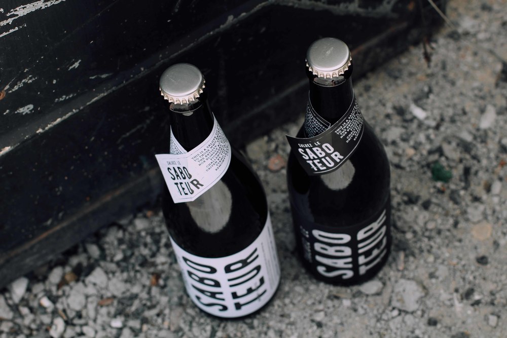
Saboteur is not a typical bottle of wine. This is one that salutes those who master a craft and pays homage to an uncompromising and rebellious spirit. Whitespace Creative designed the packaging to be strong, bold, and respectful of the notes in the wine.
“The Saboteur is a master craftsman, dedicated to his art and proudly fighting to showcase the unique and authentic fruits of his hard work and labour. The Saboteur found it’s roots in the French industrial revolution, where the original Saboteurs protested the uprising of mechanisation and industrialisation through sabotaging the new machinery by throwing their wooden clogged shoes, called ‘Sabots’ into the machines. They were a group of people who despised the new industrial era that stripped craftsmen of their purpose.”
“Niels Verburg and his wife Penny are unabashed Luddites who apply a technology-resistant philosophy to their winemaking methods. They pride themselves on ‘farming conscientiously with minimum mechanization’ and aiming to make a wine that’s ‘as natural as possible, with little or no intervention.’”

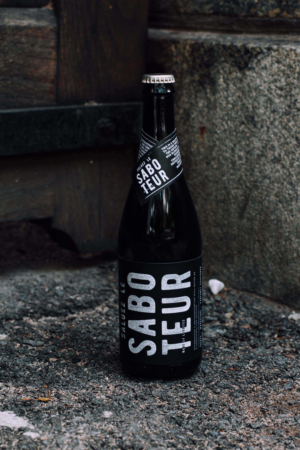
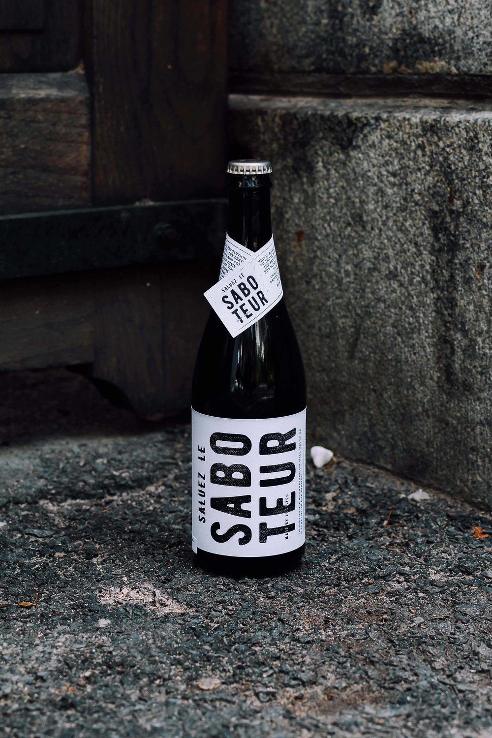
“Niels and Penny decided to bottle this premium quality red blend (recently awarded a 5 star Platter rating) in a crown cap bottle, immediately giving the wine an edge and difference – one that is never seen on your typical wine shelf. This unique bottle was the perfect canvas on which to create a different label that is true to the Saboteur name. Using screen printing techniques – looking to replicate a handmade style that often produced rough but beautiful results – was coupled with a bold, grunge inspired layout and typography. This graphic label emerged to embody a movement, one created to bashe down walls in the wine community and change perceptions of how good quality wine should be represented.”

Saboteur’s black and white labels almost look like they’ve been pulled from a newspaper, using only text to communicate the brand’s confidence. The wine bottle itself is a unique, more modern shape, and the bottle does not use a cork the way traditional wine bottles do. This clearly lets us know that Saboteur is a new way of thinking about wine. Bottles come wrapped in paper individually, making the process of opening them even more special and memorable.
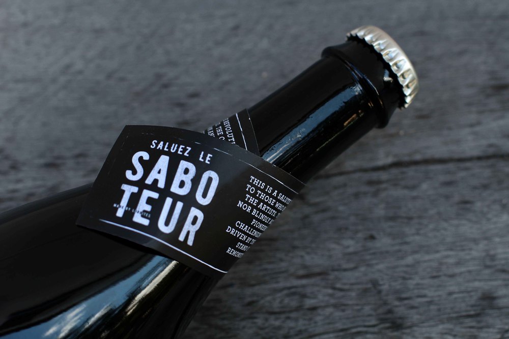
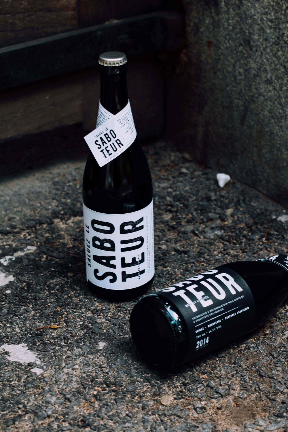
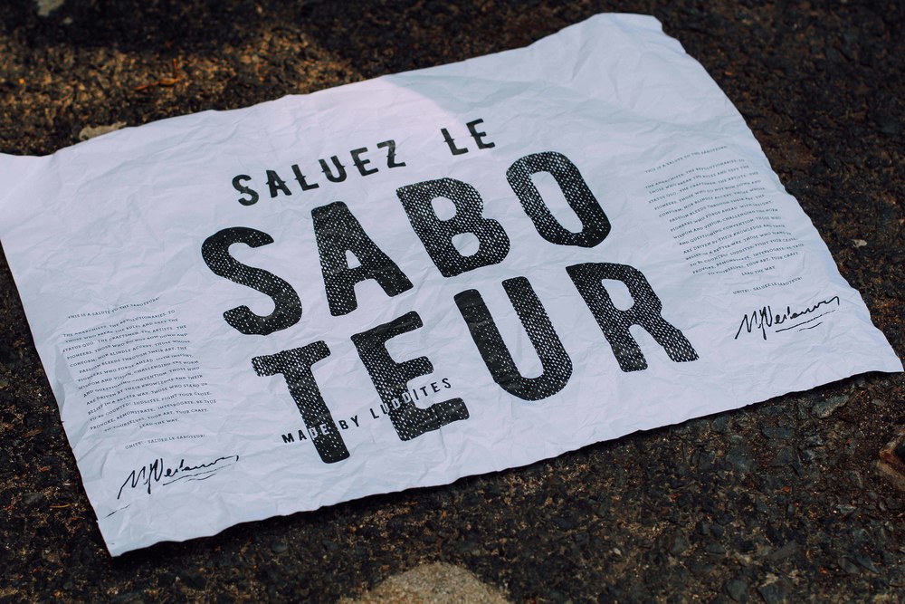
“The label is accompanied by a neck tag and rustic wrap – the later posing as both a wine wrap and a poster, that can be pasted up in true Saboteur spirit. The overall concept for this design was to create a label that represented the art of craftsmanship in every way, it needed to be real, grounded, filled with integrity and completely unpretentious.”


