

Kinerapy is a revolutionary line of products for advanced rehabilitation techniques. Combining the words “kinesis” and “therapy,” it’s specifically for professional doctors to help patients after serious trauma.
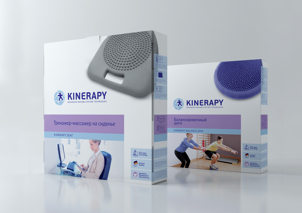

Designed by Clёver Branding, the packaging features a clear image of the product against a crisp, white background. This allows the item to stand out for easy identifying. Because the product line is geared toward professionals, Kinerapy needed to have a clean-cut and straightforward appearance, expressing a line of therapy tools that are effective and no-nonsense. A slick sans serif font looks confident and also modern, implying that Kinerapy offers cutting edge therapy for its patients. Additionally, photos of happy clients appear on the front, showing a correlation between using the products and gaining back a full range of motion.


