
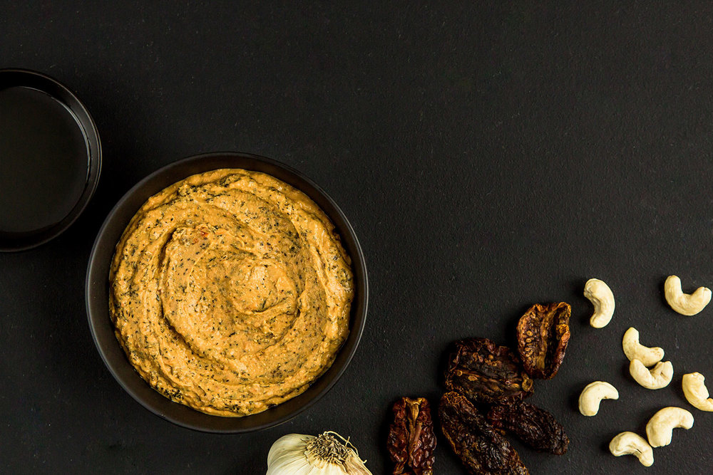
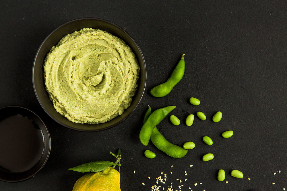
Bold, bright and eye catching. The packaging of Dipnotics – a series of deliciously natural and healthy dips- has been designed by Design Womb to visually capture the essence of the brand.
Talking about the project, the team in the studio comments “We worked to launch this brand from the ground up and the food packaging design reflects our art direction, brand voice, copywriting, photography, brand identity and logo design. We helped define the brand’s quirky personality through humor and playful lab-like layout. The dip packaging is colorful and we used humor in the brand voice to keep things light-hearted and healthy.”

The result is a set of retail-ready dips which feature custom developed wrap-around sleeves and a bold mouth-watering website. Deliciously good!


Designer & Art Director: Nicole LaFave
Photography: Lucy Hewett
Copywriting & Brand Voice: Zach Golden


