

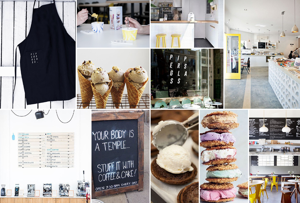
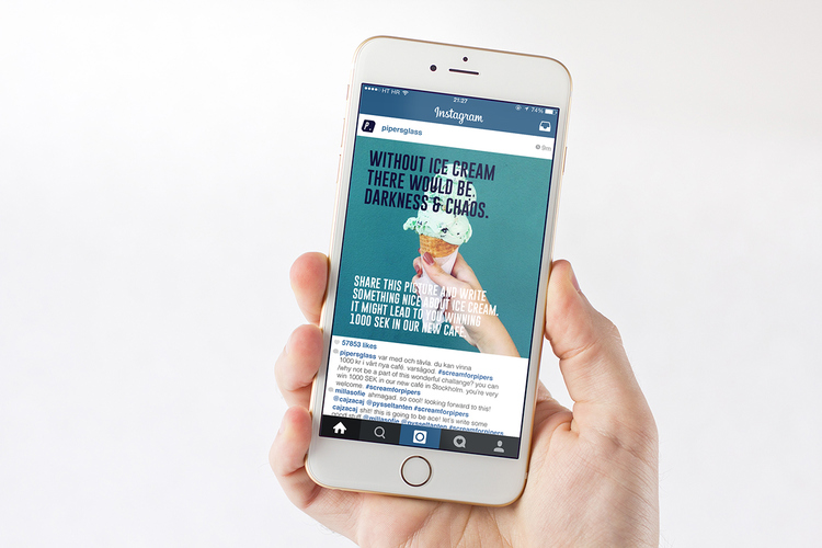
“Without ice cream, there would be darkness and chaos.” That might sound a bit drastic, but we certainly can’t disagree. Camilla Daniellson’s concept for Pipersglass’ logo, graphic elements, cafe, and packaging designs is a fun, youthful, and colorful creation. Using a simple, all-caps slanted typography, playful hues and confetti-inspired designs, she has created a look for Pipersglass that makes it accessible and tempting.

The pints of ice cream come in boxes similar to what you might get from a restaurant for takeout. The top folds open, but the bottom is circular, like a traditional ice cream pint container. These two differing elements set Pipersglass apart from other ice creams on the market. A small wooden spoon fits in the bottom of the container, perfect for those who just can’t wait to get home and have the sweet treat.


The Pipersglass popsicles are in a mostly clear packaging, with the same confetti-style graphics covering them. The blues, pinks, purples, and oranges have a slightly 80s vibe to them, but the brand is undeniably modern. Using humorous quotes like, “Your body is a temple, stuff it with coffee & cake!” Pipersglass has an especially strong appeal, coming off as a brand that doesn’t take itself too seriously and knows how to have fun.


Designed by Camilla Daniellson
Country: Sweden


