

Adorable. Cute. Endearing. What comes to mind when you think of these words? If your answer is vikings and dragons, then you might be thinking of the packaging for The Old Viking peanuts. There’s something charming about these surly cartoon characters that makes them lovable and delightful.

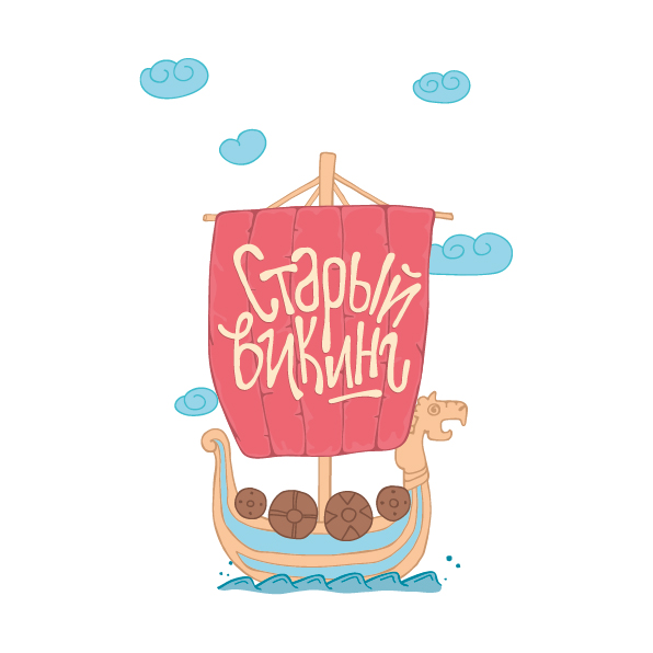
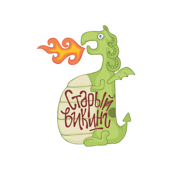
“I put an idea into each package: each character on the package kind of represents the flavour. For example, a package with peanuts of wasabi flavour has a dragon on it, the package for the peanuts with a prawn flavour has a ship with a pink sail.”
Kristina Ivanova designed the packaging with bright colors that are playful and eye-catching, complete with bold reds and vivid oranges that tie each individual flavor into the overall brand. The logo is strategically placed over bloated dragon bellies and full viking beards, giving The Old Viking a comical edge that is equally appealing to children and adults.


Designed by Kristina Ivanova
Country: Belarus


