Shortcross Gin
by Elizabeth Freeman on 03/23/2015 | 1 Minute Read
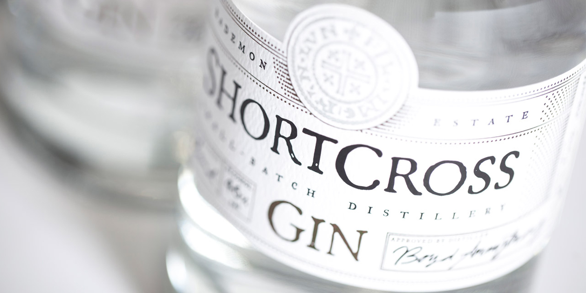
Established in 2012, ShortCross Gin is the first craft gin to be distilled in Northern Ireland. A husband and wife team built the distillery on a historic family estate just outside Crossgar, County Down and then called in the experts at Paperjam to develop the visual style for the branding and packaging of the spirit. First, tasked with creating a name for the gin, Paperjam was inspired by the location and heritage. “The name ShortCross came from the Gaelic for Crossgar -‘An Chrois Ghearr’ meaning ‘the short cross’. It had natural air of history and heritage associated with it and subtly referenced the location of the distillery.”
In developing the brand, Paperjam focused on the heritage associated with the name ‘ShortCross’ and after some research discovered the short cross penny, a coin that dates back to the tenth century. After sourcing an original coin, high-resolution scans were taken so the artwork could be incorporated into the gin’s branding and packaging. Knowing that Shortcross Gin would need to stand out within a competitive market, Paperjam focused on creating an art direction that would reflect the quality and uniqueness of the craft gin and that would appeal to a high-end market. Sitting high, at the top of the gin’s label is the beautiful logo mark, made from the short cross penny and stamped with a copper foil. The accompanying typography is bold, set in all caps and has rugged, slight imperfections which evoke a feeling of another era.
“We designed labelling that would reinforce the quality of the gin, using 3 foils - silver, copper & black applied by CMI Print Services and heavy GF Smith textured parchment papers.”Paperjam made the design decision to elevate the brand one step further by bringing in the concept of creating labels which would be personally customized per batch. Flanking both the right and left sides of the labels area designated areas where the owners could add their own personal touch to each bottle of ShortCross gin. “The label documents the distillation process by openly displaying the batch number, flavour and alcohol content. The copy created for the label also helped emphasis the handcrafted, artisan qualities of this super premium product.”Only 3 years into running a distillery, the ShortCross team seems to be doing extremely well in the market. Being sold at Fortum & Mason (fancy!) and receiving the prestigious “Silver in Gin” design award for the amazing branding Paperjam created at The Spirit Design Masters 2014. Congratulations to both teams on all your success!
Designed by Paperjam Client: Rademon Estate Distillery
Country: Ireland