The Dieline Package Design Awards 2013 Winners Announced at The Dieline Package Design Conference at HOW Design Live: Innovative Student Project takes Best of Show
The Dieline has announced the winners of The Dieline Package Design Awards 2013 presented by Inwork at The Dieline Package Design Conference, held in conjunction with HOW Design Live at the Moscone Center in San Francisco.
The Dieline Package Design Awards are a worldwide competition devoted exclusively to the art of brand packaging. The 2013 competition received over 1100 entries from 61 countries around the world.
42 winners across 13 different categories were awarded a 1st, 2nd, or 3rd place Award, and the highest scoring project received a one-of-a-kind “Best of Show” award, and presented a case study at The Dieline Package Design Conference 2013. An “Editor’s Choice” award was handpicked by Andrew Gibbs, Founder of The Dieline. A new Sustainable Packaging Award was created to highlight innovative contributions to the field of sustainable package design.
The Dieline Package Design Awards entrants were judged by a highly esteemed panel of 12 industry experts, based on quality of creativity, marketability and innovation. Debbie Millman, President of Design at Sterling Brands, served as the chairwoman of the judges.
View the winners below!
// ]]>
Dieline Awards 2013 Opening from Stephen Grimm on Vimeo.
BEST OF SHOW
BANDiful
Designed by Vivi Feng & Yu-Ping Chuang
For the first time in The Dieline Package Design Awards history, an innovative student project has been named Best of Show. Vivi Feng & Yu-Ping Chuang created an innovative solution to a common problem, the challenge of using a single hand to apply a bandage.
Applying a bandage using a single hand can be challenging, especially when both of your hands are injured. BANDiful solves this problem by applying a special structure to avoid extra steps in unwrapping bandages. Not only does BANDiful offer a functional benefit, but also enables a new personal experience of using a bandage. Incorporated with a hanger on the top of the package, the consumer can hang BANDiful on the wall near his/her desk. With bright patterns, bandages are no longer invisible but beautiful. Normally people use bandages only for small wounds, but by offering a convenient user experience, a consumer could also feel emotionally comforted as well.
"For the first time in The Dieline Package Design Awards history, an innovative student project has been named best of show. This project was the highest rated project in the competition out of 3 rounds of intense judging from our judges. The two brilliant students created this project as their final thesis project at Pratt. It is an innovative solution to a common problem: the challenge of using a single hand to apply a bandage."
Andrew Gibbs, Founder and Editor in Chief, The Dieline
EDITOR’S CHOICE
Method Ocean Plastic Dish + Hand
Designed by Method
Method created the world’s first bottle made with ocean plastic - It’s estimated that several million tons of plastic makes its way into our oceans every year, polluting the environment and hurting our marine populations. Method is tackling this issue with a unique product packaged in bottles made from a blend of ocean plastic + recycled plastic (PCR).
"For the first time in The Dieline Package Design Awards history, an innovative student project has been named best of show. This project was the highest rated project in the competition out of 3 rounds of intense judging from our judges. The two brilliant students created this project as their final thesis project at Pratt. It is an innovative solution to a common problem: the challenge of using a single hand to apply a bandage."
Andrew Gibbs, Founder and Editor in Chief, The Dieline
SUSTAINABLE PACKAGE AWARD
Sustainable expanding bowl
Designed by Tomorrow Machine / Innventia
Swedish research company Innventia teamed up with designers Anna Glansén and Hanna Billqvist from design agency Tomorrow Machine to develop a sustainable package customized for freeze-dried food. The instant food package combines different aspects of sustainability. It saves space in transportation by being compressed and it is made out of a 100% biodegradable material from renewable sources, invented by Innventia.
"For the 2013 awards, a new Sustainable Packaging Award was created to highlight innovative contributions to the field of sustainable package design. As package designers, it is our innate responsibility to design packaging with our earth in mind. Each and every one us who designs consumer product packaging for a living has the ability and the duty to create packaging that has less of an impact on the world we all live in. This project does just that, and shows designers that you can create compelling and effective packaging out of sustainable materials."
Andrew Gibbs, Founder and Editor in Chief, The Dieline
FRESH FOOD
1st Place: Metropolitan gourmet boxes
Designed by Lufthansa & LSG Sky Chefs
As part of its “Special Moments” in-flight service, Lufthansa Airlines incorporates innovative, out-of-the-ordinary ideas to pamper passengers in all travel classes on selected flights. These ideas include surprising passengers with little gifts to mark a special occasion and treating them to outstanding culinary experiences, such as vinegar and whiskey tastings.
2nd Place: Kefalonia Fisheries
Designed by mousegraphics
mousegraphics designed the consumer's next move: a fresh, cleaned and ready to be consumed fish. It does not require but the simplest cooking, using only fine herbs which will bring out its unique qualities and taste. A differentiating band, on an otherwise transparent packaging, offers much more than the image of a serving suggestion. It works like an x-ray image of a pure product of Greek nature, as well as a preview of the particular culinary experience, the moment just - before-eating, when a fish is opened and all fine scents and juices are liberated.
3rd Place: DYNAMITE
Designed by M.I.L.K. food design & innovation lab
DYNAMITE - The sausage that bites back (Die Wurst die zurück beisst) M.I.L.K. food design & innovation lab developed product and packaging design for a mind - blowing chili flavored sausage innovation for Gerrmany’s retail market. Successfully launched as a seasonal highlight product for those who like it hot!
PREPARED FOOD
1st Place: VersaFlow™
Designed by O-I New Product Development & Innovation
Consumers have high expectations for the brands and products they choose today. They are demanding functionality, versatility and ease-of-use to fit modern needs. At the same time, brand owners and retailers are looking for ways to grow, transform and inject new life into their food products and categories.
A simple device, VersaFlow™ is a glass jar with a lip on the rim to make pouring easier and reduce mess. The jar debuted at Walt Churchill's Market in northwest Ohio, launching a new custom made marinara sauce from the market’s chef.
For Consumers, VersaFlow delivers a more user-friendly brand and product experience while reducing food waste and creating an emotional connection around sustainability. It’s an ah-hah moment every time somebody uses it.
For glass manufacturer Owens-Illinois, VersaFlow represents a glass innovation aimed squarely at re-imagining, improving and enhancing the food category, while deepening brand owner, retailer and consumer engagement with glass.
2nd Place: Not For Sale
Designed by Hall
Over 25,000 women work as prostitutes in Amsterdam. Not For Sale is a non-profit organization that stops human trafficking, providing dignified work for women vulnerable to exploitation in Amsterdam and abroad. In Amsterdam’s Red Light district, Not For Sale offers culinary training to the vulnerable, helping them prepare soups for others working in the brothels. Our job was to create a story, an identity and a series of products that was as powerful as their name and mission. Not For Sale transforms the exploited into the empowered. With each jar, women are promised a new future. This soup is Not for Sale. We are Not For Sale.
3rd Place: Mighty Rice
Designed by mousegraphics
What is mighty-er than rice? Mighty Rice, of course! mousegraphics was asked to design packaging for Mighty Rice. "To meet the expectations of an overseas based client was a challenge we accepted with enthusiasm. Our design approach developed through a series of emails and Skype calls between Athens and the exotic Mauritius, whilst we gradually absorbed the information that described this food product as ethically cultivated and dynamically positioned in the contemporary market. This experience was incorporated into the design framework. Thus, a mighty combination between the stated, the symbolic and the imaginary emerged. The essence of the island and the grain -the basic unit of every rice production- are rendered visible through clear, dynamic albeit elegant, transparent, duo-chromatic (b&w), non-folkloric design choices."
Merit: Natural Delivery Pack
Designed by Grupo imasD S.A.S
An integral packaging design is developed for Natural Delivery, a delivery service of healthy food. The unique structure of the folding box integrates an optimal and safe transport. To limit waste, time and increase ease of use and personal experience, the structure can also be doubled as a plate and a placemat.
Merit: Qizini premium pizzas
Designed by Brandnew
Qizini launched a brand with quality, fresh, and convenient products that would stand out in the retail environment. The premium pizzas are part of an assortment – richly topped with beautiful high quality ingredients and superior taste.
DAIRY, SPICES, OILS, SAUCES, AND CONDIMENTS
1st Place: Bzzz
Designed by Backbone Creative
Bzzz's super-premium, all-wood packaging was developed not so much as a pack, but a pack that becomes a permanent piece of one's kitchenware. It gives a totally new spin on the idea of a household honeypot. Developed originally a gift for VIP banking clients in Russia, the response has been so positive that the brand is in production for a full-scale international roll-out.
2nd Place: Posh Birds
Designed by Springetts Brand Design Consultants
Posh Birds is a new premium egg brand created and developed by Springetts Brand Design Consultants and launched by Noble Foods.
Springetts was approached by Noble Foods, who wanted to introduce a speciality and rare breed egg brand into the fixture. Springetts developed the Posh Birds brand with the aim of making this niche product category more accessible to the mainstream shopper.
3rd Place: My Olive Tree
Designed by mousegraphics
The famous Greece design firm, mousegraphics, asked to create a product identity - naming and packaging design - which was meant to address, first of all, the members of a Greek family of olive oil producers in Karpofora, Messinia. "It is very rare for a client to come to us with the simple request of "creating a family gift", but this is exactly what happened in this case. We had to pay tribute to a strong, living tradition and this is exactly what we did. We used a children's drawing of an olive tree and we placed every family member's name on its branches. We named the product, "My olive tree" because this is exactly what it is: the precious olive tree which, identified with one family tree symbolizes the bonds, efforts and legacy of this one family and is offered to a number of other such families around the world, in the form of an 'olive oil' present."
Merit: Madonna Dell/Olivo Special Edition
Designed by nju:comunicazione
Madonna Dell/Olivo is an award-winning extra virgin olive oil produced by Antonino Mennella on his 2000-tree farm located in the Southern Italian region of Campania. This year will see the launch of a special, 2013 edition Madonna Dell/Olivo with a packaging solution, developed by multidisciplinary design studio NJU, which leverages - through a distinctive 1.5 litre magnum bottle choice, texture and etched illustrative detail - the heritage, high quality and celebratory spirit associated with champagne and the experience and passion of a craftsman.
Merit: A Couple of Drops
Designed by Beetroot Design Group
A Couple Drops is the respectful turn to the human need and wellbeing - to our tradition, to our roots - the return to the Greek Islands.
CONFECTIONARY, SNACKS, & DESSERTS
1st Place: OOH OOH AH AH! Banana Jam
Designed by Peck & Co.
OOH OOH AH AH! is all about fun. Emilie Wildiers came to us with the idea of building a new brand around her unique, banana-based jam recipes. She runs a well-known company in Belgium that has been creating various jams and jellies since the 80′s. But, this is not just another condiment to add to the pantry. It’s deliciously different. A shareable delicacy for every member of the family, from choosy moms and dads, to the kids.
"The name we came up with is unmistakable in any language. Say it out loud, and you can’t help but smile. We developed a central hero for the brand (“Nom-Nom” the monkey), who gets increasingly excited as he tries each delectable flavor."
2nd Place: 'lette gift box à la ronde
Designed by a l m project inc.
The 'lette gift box à la ronde transforms the brand icon into the package itself – gift box as a grand gesture. Removing the lid reveals a field of macarons, each held neatly in place with a custom die cut tray. Recipients of the 'lette gift box à la ronde are invited to select flavors just as they would pick a bouquet from a field of flowers; transporting the experience of visiting a 'lette bakery to home or office.
Let them eat macarons! The 'lette gift box à la ronde comes in Silver and Violet and holds 60 macarons.
3rd Place: The Four Fat Ladies
Deisgned by Matter
Four lively women that are passionate about baking came together to create a warm and friendly bakery that serves the most delicious American pastries in town.
Merit: Trick or Treacle
Designed by Design Bridge
After the success of our limited edition Jubilee tin, Tate & Lyle asked Design Bridge to create one for Halloween, to help create more appeal at what was traditionally a quiet time of year for their Black Treacle brand. Design Bridge created not one tin but three, a collectable trio of ghoulish carved pumpkins that were designed to sit alongside each other on shelf and communicate with consumers. An adult brand that now engages with kids.
Merit: Maison Dandoy
Designed by Base Design
Founded in 1829, Dandoy is a traditional Brussels bakery who provides itself with a rich heritage of savoir-faire and artisanal craftsmanship. Base Design's solution for Maison DanDoy is a playful take on a long-established historical legacy: the new Maison Dandoy brand is built on a toolbox that consists of a logo, typography, illustrations, the color palette black-gold-white, and simple packaging to reduce waste.
The visual part is enriched with brisk copywriting, from a new brand manifesto and a new baseline - Maison Dandoy, Spectaculoos Speculoos - to several taglines, craftsmen's portraits, speculoos figurine dialogues, and other stories written in a no-nonsense, humorous tone of voice. From now on, Maison Dandoy is a brand with a consistent, recognizable voice.
NON-ALCOHOLIC BEVERAGE
1st Place: COFFEE SUPREME
Designed by Hardhat Design
Coffee Supreme’s take-out cups were already known in NZ and Australia for being unusual, distinctive and quirky, so while we knew from our re-brand brief that they wanted the brand to ‘grow up’, it was important they didn’t lose their individuality.
The cups were also a great place to put across the company's character & principles; their love & enthusiasm for the handmade craft of making coffee, their confident and quirky nature, their approachable and supportive staff, and the importance they placed in staying true to the good old fashioned standards the company started out with.
2nd Place: BOLU TEA
Designed by Curious Design
Bolu are purveyors of fine quality tea, directly sourced from Fair Trade plantations in Darjeeling, North India. "Our client's brief was to design a suite of original, contemporary packaging that created an overall 'umbrella' look to the consumer, but that also reflected the individuality of each tea variety."
The starting point to achieving this goal was the creation of a totally unique pack shape. Curious worked closely with Think Packaging on this process. After exploring many options, their packaging ninja came up with a revolutionary solution, which culminated in a perfect balance of aesthetics and function. Visually the pack looks completely harmonious-due to the integration of flowing, curved lines that echo traditional Indian architecture. However form is nothing without function, so the true genius was ensuring that this unique pack was also cost effective to produce and easy to assemble. Curious then designed sumptuous iconography and fused with it with a vibrant colour palette, to create a contemporary range of packs. Bolu and Curious-just your cup of tea!
3rd Place: Paris Baguette Koffy
Designed by Karim Rashid
Logo, branding and packaging for a top-quality coffee beverage designed by Karim Rashid for Paris Baguette. The Koffy logo graphics and glass bottle form give the beverage the shape and look of a coffee bean.
Merit: Mio
Designed by Landor
Small, Fun, Intuitive, Innovative Water Enhancer. It mixes the user’s personal taste and style to create a new experience every time. Far more than flavor, Mio empowers people to transform any liquid into their own unique beverage, fulfilling a role that no other brand has done before.
Merit: The Art of Tea Collection
Designed by OD
Deac wanted a new concept for their restaurant quality tea and OD rose to the challenge. The main goal was to liven up the hospitality industry’s boring world of tea-drinking. Not only that, Deac wanted the individual packaging to be easily disposable. Inspired by paintings in watercolors, OD developed a rich and inspiring world of tea. The tea assortment consists of large packaging that contains unique single-packs. To be specific: a single-serving package, drip tray and disposable paper in one! To top off this unusual hospitality concept and make it attractive to customers and owners alike, a special tray was designed in the style of a painter's palette.
Merit: Love in a cup
Designed by Elmwood
'Love in a cup’ is a promotional pack of tea, created by Morrisons as a fun and unique gift. Intended to capture a moment between loved ones, it’s the perfect way to simply say I love you. The tea bags come with five different romantic messages on the tags, to show your loved one you care every time you put the kettle on. The charming pack design incorporates a handwritten typography style and hand-drawn imagery, which adds a sense of occasion and romantic fun to an everyday task. Sometimes it’s the simplest things that create a tender moment between loved ones, from new couples to older married ones.
BEER, MALT BEVERAGES, & TOBACCO
1st Place: Ippon Matsu Beer
Designed by Kota Kobayashi
“Ippon Matsu” means “one pine tree.” In the city of Rikuzentakata, on the northeastern coast of Japan, some seventy thousand pine trees lined the shore and, for decades, they stood as a place of national scenic beauty. On March 11th, 2011, the tsunami nearly swept the entire city off the map. Out of the great forest that once stood, only a single pine remained. For the survivors of the disaster, that one tree became a beacon of hope.
This beer’s design represents a symbol of charity and hope for Japan’s brighter future. A scroll-like, handwritten label seals the top with the story of Ippon Matsu written on the inside. The label is a solitary pine made of three triangles that are facing up, symbolizing the wish for progress in the reconstruction efforts.
The purpose of Ippon Matsu Beer is to spread the message of charity, raise awareness and help the victims of the 2011 tsunami. All profits are donated to the reconstruction efforts in Japan.
2nd Place: Mateo & Bernabé and Friends
Designed by Moruba
Mateo & Bernabé is the first craft beer from La Rioja, Spain - designed by Moruba. Mateo & Bernabé are Saints of La Rioja, the company takes it name from these two saints, these are the company's first two beers. In the future, they could to make more beers, and the names of these future beers will be other saints, like Santiago, Fermín, Patricio,… That's why the brand include "and friends".
In the label, the red number represent the day of the Saint which is a holiday and that's why is red. Above the number is the drawing of a fish or a billhook.
The fish reference the history of Logroño. In 1.500 when the french army invaded the city , the people survived eating fish, that they caught in the river at night, thanks to this, they defeated the enemy on the 11th of june, the day of St. Bernabé. This story is on the back label. The billhook, is a symbol of the grape harvest. St. mateo is on the 21st of september, he is the saint who takes care the land and the harvest. This day is a big party because wine is very important for the people in La Rioja. Also this story is on the back label. The neck label has got the stories of Mateo and Bernabé. These labels reflect the "Glocal" concept, the beers are made in La Rioja, with a local design but they tell an interesting story to the whole world about our land.
3rd Place: Velkopopovicky Kozel
Designed by Yurko Gutsulyak
It was necessary to create the design for the limited edition of Velkopopovicky Kozel beer. The project is aimed at emphasizing the values of the famous Czech brand and enlarging the number of its fans. The design of the limited edition reflects the ancient traditions as well as the mastership of the Czech brewers. Every can is a part of the Old Czechia.
Beside the collectors’ design, the Velkopopovicky Kozel beer offers gifts to everyone who will unravel the special message that is encoded on the can.
Merit: Stoutnik
Designed by Hired Guns Creative
Competition for visibility on a West Coast craft beer shelf is fierce. Stoutnik's frosted matte black bottle is immediately visible from a distance and printing techniques not usually seen on craft beer labels increase the differentiation even more. The constantly changing colours of the satellite-esque foil stamp draw the eye as the customer walks past. The stylish, sparse, contemporary design compels him to pick up the bottle. The story told in blind-embossed Morse Code seals the deal, propelling him from a state of curiosity towards a confirmed launch plan.
Merit: Ticketybrew
Designed by Carter Wong Design
Briefed by entrepreneurial brewer, Duncan Barton to create the name and packaging for his start up business, Carter Wong Design first set to work trying to discover a memorable name that would then lend itself to a graphic treatment when it came to designing the label and overall identity. "Beginning initially with just two brews, a Belgian Dubble and a traditional Pale Ale, and brewed in limited numbers it was important that we found a very cost effective way of producing and printing the finished label designs."
All parts of the brief fell into place once we’d decided on the brand name, being a take on the word ‘Ticketyboo’, meaning everything is going alright and proceeding quickly, something Duncan’s business was certainly starting to do. Therefore with a slight twist appropriate to his venture the name ‘Ticketybrew’ was agreed and from then on the design solution virtually solved itself.
WINE & CHAMPAGNE
1st Place: Safeway Bottle Sleeves
Designed by by Stranger & Stranger
Stranger & Stranger teamed up with winemaker Truett Hurst and retailer Safeway to launch an innovation initiative aimed at spicing up the look of our wine shelves. Stranger identified 22 niches and buying occasions that might benefit from enhanced packaging and developed a patented bottle sleeve that contains everything from quotes to recipes.
Says Kevin Shaw, Founder and Creative Director of Stranger: “The idea came from our own No.13 pack. We created brands in a packaging format that stands out and adds value, interest and gifting opportunities. The added real estate that the over sleeve gives us has allowed us to engage with people in a way that a tiny back label never can. Everyone just wants to pick up and read these packs."
2nd Place: WINES OF THE WORLD
Designed by Lavernia & Cienfuegos
This is a range of wines that Belgian supermarket chain Delhaize offers within its own brand “365”, which includes simple, everyday products at affordable prices. The cork is a sign of humility, an object of little value, often used as craft material, as a simple and easily manipulated element with which to play and create. The use of cork gives it the air of something simple, typical of an everyday product. The cap is the element that unifies and personalizes the whole range. The motif designed for each label refers to the country of origin.
3rd Place: Rasurado
Designed by Moruba
Creation of concept and packaging for Rioja D.O. wine. The objective of the project was to choose an icon that tells a story, impressive packaging that will stand out from the competition. There were no other requirements.
The solution was simple - the icon of a barbershop, cylindrical in shape like a bottle, easily recognized and attention-getting outside of its normal context, the name RASURADO (clean-shave/shaven), alluding to the barbershop, the perfect shave, and a story: the town barber, who after years of shaving the region´s wine markers knows all the secrets of their trade, makes his own wine - the barber´s wine.
Merit: Winehouse
Designed by PROUDdesign
Winehouse (“wijnhuis”) stands for good wine, in a good house for a good cause. A Dutch initiative from a local wine expert and designer. The first one selected a beautiful organic wine. The other designed the bottle and the packaging. Built with layers of recycled carton from old wine boxes. Produced with friends and small companies and the profit will go to an Amsterdam foundation for the homeless.
SPIRITS
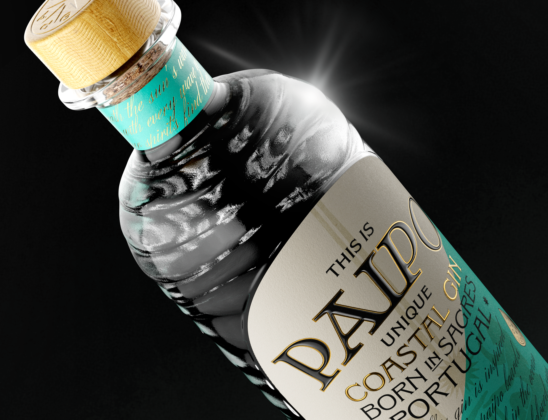
1st Place: VL92 GIN
Designed by Rare Fruits Council
VL92 Gin was born of the quest of two entrepreneurs to find their ultimate gin. Built upon a malt wine foundation, VL92 Gin has its roots in the Dutch genever tradition. The malt wine gives it its boldness; its complexity derives from the play between botanical elements that finish with the eccentric, citrusy endnote of a most surprising ingredient: coriander leaf. The gin is named after a historic Dutch sailing vessel whose freight contained exotic spices too daring for the local genever recipes - but wildly perfect for a VL92 Gin.
2nd Place: John Walker & Sons – Diamond Jubilee
Designed by Raison Pure NYC
John Walker & Sons Diamond Jubilee is a very limited edition whisky created as a tribute to Her Majesty Queen Elizabeth II’s 60 years of enlightened leadership. To mark this historic occasion as a royal warrant holder, Johnnie Walker asked Raison Pure NYC to become the creative force and Art Director for all the design and creative aspects of the project.
3rd Place: Absolut Unique
Designed by Family Business
Absolut Vodka have for years led the innovation in vodka packaging, with limited edition packs like Absolut Disco, Absolut Rock and Absolut Illusion. For 2012, it was time to redefine limited editions it self.
The idea was to make four million unique bottles, so that each and every bottle becomes a limited edition in itself. We had to rebuild the production line, and use every possible aspect of glass decoration in a new way.
The campaign ran globally between september and december, and sales have been amazing, as well as media coverage.
Merit: ABSOLUT TUNE
Designed by The Brand Union
The brief was to create a product design for an unexpected blend that brings together a Sauvignon Blanc from the world-renowned Marlborough region of New Zealand and ABSOLUT VODKA.
Merit: The Balvenie 50
Designed by Here Design
"The brief was given to Here Design to create a special packaging for an extremely are 50 year old single malt, released to celebrate the work of The Balvenie Malt Master, David Stewart, favoured by whisky connoisseurs around the world. David has dedicated his entire working life to the art of single malt making and is one of the most respected craftsmen in his field. Exactly 50 years to the day that David joined the highland distillery as a seventeen year old apprentice, his incredible devotion is being recognized with the release of a rare cask of The Balvenie single malt distilled in 1962. Just 88 bottles of The Balvenie Fifty will be available, with an RRP of £20,000 per bottle.
HEALTH & BEAUTY
1st Place: Oxford
Designed by The Bakery
Oxford is a new tissue paper brand that The Bakery Design Studio developed from scratch. The idea was to create a completely new look for such a mundane product. "We started with a name to give it some character, create a matching logo and a stricking uniform to match. Though constrained with the packaging format and materials, we found an original way to brand not only the existing product, but the ones to come as well."
2nd Place: SOLCARE
Designed by Lavernia & Cienfuegos
Packaging and graphic design of sun-care range, sold in Mercadona supermarkets. The project had a very demanding brief to optimize processes and costs, without sacrificing that the product communicates quality, is attractive and has a strong presence on the shelf. For the 36 references we designed two bottles. These two packs support different lids and different dosing mechanisms: pumps, sprays, disc-top... and also the design gives an effective response to the two objectives of the project: on one hand, solve problems of logistics and production; on the other, with only two packages, obtain a highly differentiated range of products, with its own personality. The colors of the containers provide the necessary differentiation between the sub-ranges of products: sunscreen, tanning, aftersun... The graphics serve as a rapid and clear identification of each one of them. This is achieved by the prominent and powerful presence of a numeral that indicates the protection factor, a key element in the purchase decision, and that at the same time strengthens the personality of the range.
3rd Place: dinoplatz
Designed by Crosspoint New York
"Dinoplatz is a new makeup line from 'Too Cool For School', a unique cosmetic brand that collaborates with artists for their products. Considering the small number of total products of the Dinoplatz line (10 items), it took the somewhat long period of 10 months for the completion of the design planning and packaging development.
Merit: Essential Patch Packaging
Designed by Ratowsky Creative
Grason Ratowsky of Ratowsky Creative came together with the Essential Patch team to create and develop a hip new brand identity, voice and packaging solution for the company's new line of organic aromatherapy patches.
PERSONAL CARE & CLOTHING
1st Place: Brokula&Z
Designed by Bruketa&Zinic OM
Brokula&Z is a clothing brand by Bruketa&Zinic OM, made from organically grown materials. With Brokula&Z, everything good comes from within so all the clothing contains hidden messages written on the inside that can be seen only by you… and whoever undresses you. The messages are actually funny dialogs between Brokula (Broccoli) and Z (a bird) who are the main characters of the product's visual identity. We had to create a packaging that had to be as eco-friendly as possible, in line with the brand promise.
Brokula&Z packaging had to serve as a fun giftwrap and a practical protection of the product at the same time.
2nd Place: Little Green Bag
Designed by Lush - Fresh Handmade Cosmetics
Little Green Bag is a carefully chosen selection of five naked, or unpackaged, cosmetics and a re-usable aluminium tin - all wrapped up in an organic cotton scarf, woven and screen printed especially by a not-for-profit women's co-operative in India. This wrapped bundle of unpreserved goodies has a recyclable cardboard sleeve with instructions on how to use the products, a fun game and a 'how to' re-wrap your organic scarf with traditional Japanese furoshiki techniques. There's even a 'face sticker' on the label of the person who packed it for you. The best part? In an emergency, you can wear the scarf with the fig leaf print to cover your modesty!
3rd Place: Heirloom Cufflink Packaging
Designed by HollenWolff
HollenWolff is a Milwaukee, Wisconsin based manufacturer of mechanical cufflinks and shirt studs, each set of which is comprised of between 14 and 22 components that have been precision-machined to watch-like tolerances from solid bars of surgical grade stainless steel. HollenWolff required a packaging concept that reflected the ingenuity, substance, strength, domestic origin of manufacture, and most importantly the craftsmanship of the product it contains. In addition, the package needed to be efficiently customizable in a production setting with respect to serialization (each set is individually numbered), and also with respect, as a heavily gifted product, to accommodating personalized messages that are capable of being permanently inscribed on the outside of each external housing (keepsake box). HollenWolff sought to design a package that would not be discarded, but rather become a comprehensive and indispensable part of the heirloom investment. The finished result not only realizes these objectives, but also establishes the personality of the product for its intended owner from the moment of receipt where one immediately is introduced to substance through texture and weight, through to the completion of a powerful and anticipatory five-step reveal.
"Is it wrong that I think the packing is more covetable than the cufflinks? I might start collecting trinkets just so I have an excuse to keep the box on my desk."
Jason Schulte, Founder and Creative Director of Office - The Dieline Package Design Awards 2013 Judge
HOME, GARDEN, & PETS
1st Place: Method Ocean Plastic dish + hand soap
Designed by Method
The world’s first bottle made with ocean plastic: it’s estimated that several million tons of plastic makes its way into our oceansevery year, polluting the environment and hurting our marine populations. method is tackling this issue with a unique product packaged in bottles made from a blend of ocean plastic + recycled plastic (PCR). and the more ocean plastic we’re able to reuse means less demand for virgin materials and a cleaner planet. we may never be able to return the ocean to its pristine state, but we can raise awareness of the importance of using the plastic that’s already here. the ocean plastic in this packaging was hand-collected on the beaches of Hawaii by method employees and local Hawaiian volunteer groups.
2nd Place: Day birger et mikkelsen
Designed by BAS
The packaging concept for DAYs scented line is a part of the design program and communicative platform for DAY Birger et Mikkelsen, where brand book, labels, symbols, design, packaging and graphic manual has been included. DAY´s scented line, the competition entry, is part of the HOME collection and should to carry the brand.
3rd Place: SodaStream Source Packaging
Designed by fuseproject
SOURCE is the new carbonated water and soda machine for SodaStream, fully embodying 360-degree design and sustainability on an everyday level. With sustainability as central to SOURCE, the packaging needed to reflect this, making the choice and amount of materials key. "We started with a smaller footprint for the box overall, and with this the smaller form factor, more boxes fit on a shelf, ship more efficiently and, most importantly, we practice what we preach – less waste, more focus on what’s important. Additionally, we created a structure and packaging plan which eliminated additional packing materials, housing the water bottle in the back of the machine, aggregating all of the manual content into one book and affixing it to the front flap, using corrugated cardboard to hold it all in place."
Merit: GoFish Aquarium
Designed by My Date with a Designer Inc.
"GoFin is an aquarium food brand, which aims at creating an unexpected delightful moment for fish owners to enjoy while fish feeding. Too often, consumers find fish pellet packaged in lots of similar plastic containers form a sea of sameness and the labeling does not communicate with emotional conviction but usually looks rather like medical product instead of food for their beloved pet. Moreover, consider how these fish food containers might ironically end up being one of the billions of pounds of plastic debris in the world’s oceans – killing more fish.
TECHNOLOGY, GAMES & TOYS, MEDIA, & SELF-PROMOTIONAL
1st Place: EarSkinz
Designed by Imagemme
Utilizing the natural structural advantages of a tray for holding a product with precision, we decided to make this typically plain packaging component into a dynamic highlight for an amazing product. The tray itself helps to tell the story of what the product is for, silicone earbud covers in this case. This design takes full advantage of the fluid and dynamic potential of thermoformed plastic trays which we specified in 100% recyclable polyethylene. Another advantage of our approach is the elimination of additional exterior boxes, wraps or sleeves which reduces waste, helping the bottom lines of both the earth and our client. The tray is covered in the front by a crystal clear co-polymer film which is easy to open for the consumer by pealing away from the glued edge. Rounding out the packaging is the back label which provides instructions and copy, helping the front to remain elegant and clean. Simple to manufacture, economical, easy to use, efficiently sized, and beautiful; what more could a client need?
2nd Place: PHILIPS HUE
Designed by FLEX / the INNOVATIONLAB
HUE is a personal wireless lighting system from Philips that allows you to create and control your home lighting from your personal smart device. HUE enables you to change colors and set shades of white in a playful and interactive way. You can use it however you want: create light settings based on your favorite photos, choose from expert light recipes or set timers.
3rd Place: BERG Little Printer
Designed by Burgopak
Little Printer is BERG’s first connected product to be released into the consumer market. An example of an incredibly ambitious project by a small independent agency, the product itself, ‘lives in your home, bringing you news, puzzles and gossip from friends’ in the form of a small printed newspaper.
Merit: Siemens Hearing Aid Premium Packaging
Designed by Splitvision Design
Siemens Audiologische Technik GmbH contracted total–solution provider Splitvision Design AB to design and produce a complete packaging range reflecting the high value of its products. The aim was to create a packaging solution that was more than just a disposable container for the hearing instruments. This was achieved by creating a presentation box, which would also serve as a natural everyday storage unit for the instruments and all accessories. The pocket friendly hard case protects the valuable instruments itself while the box has a drawer suitable for batteries and various cleaning tools. Consideration for convenient storage of the user guide and warranty card was achieved by storing the items in a leather organizer, which slides neatly into the base of the package.
Merit: Lytro
Designed by Uneka Concepts, Inc.
Uneka wanted to design a package for the Lytro camera that displays it on the pedestal that it deserved. The out-of-box experience presents the camera as the hero and provides a nice reveal and easy access to the product. The ID of the packaging follows the clean look and feel of the camera. Premium design and premium materials for a premium product.
STUDENT
1st Place: Be Better
Package Design & Production: Cassia The, Cecilia Hedin, and Nadia Izazi
Logo Design: Cassia The, Cecilia Hedin, Nadia Izazi, Stjepan Ilich, and Madeline Roguschka
Instructor: Michael Osborne, Academy of Art University
This is a student group project from Academy of Art University for Packaging 4. Be Better is an innovative over-the-counter medicine line endorsed by Walgreens, one of the leading pharmacies in America.
2nd Place: Eat&Go
Designed by Olga Gambaryan, Diana Gibadulina, Alexander Kischenko, and Andronik Poloz / Frutodashiki, British Higher School of Art & Design, Moscow
Eat&Go is a ready meal for students. Designed specifically for sandwiches and soups for eating on the go.
Packaging is a plastic tube which is constructed as bellows and could be easily folded down decreasing the length of the tube (like bending section of a drinking straw). With our packaging you can eat the sandwich without getting your hands dirty. Empty packaging when fully folded is very small and easily fits into a pocket. Plastic cap lets you securely close your unfinished meal and eat or in case of soup drink it later.
3rd Place: GAGA Tea
Designed by Nathalie Hallman
An unconventional portrait of Lady Gaga – "Gaga Tea" is a conceptual tea box consisting of 10 different flavours, each inspired by Lady Gaga’s most memorable characters throughout her career so far, designed by Nathalie Hallman.
The Dieline would like to thank your sponsors for making all of this possible: Inwork and MWV.
"For the first time in The Dieline Package Design Awards history, an innovative student project has been named best of show. This project was the highest rated project in the competition out of 3 rounds of intense judging from our judges. The two brilliant students created this project as their final thesis project at Pratt. It is an innovative solution to a common problem: the challenge of using a single hand to apply a bandage."
