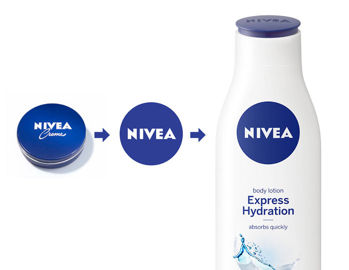
The blue tin has embodied NIVEA’s brand values since 1925. It is the brand “face“ that consumers around the world associate with trust, closeness and expertise. Now Beiersdorf AG has introduced a new global design language based on the iconic blue tin.
The new design consistently translates the successful NIVEA brand’s values into a product that consumers can see and feel, thereby making products in all categories immediately recognizable. Beiersdorf has consistently developed the NIVEA brand with a focus on its global core values. The gradual introduction of the new design for the entire NIVEA skin and body care portfolio will commence in more than 200 countries in January 2013.
“NIVEA stands for skin care, trust, quality and value for money. These are the values that our consumers all over the world appreciate. We have to ensure that our brand identity reflects these values, one aspect of which is our product design,” – Ralph Gusko, Executive Board Member for Brands at Beiersdorf. –
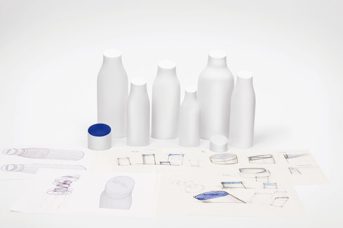
Internationally renowned industrial designer Yves Béhar joined forces with the Beiersdorf Design Management team at his San Francisco-based fuseproject studio to create a new, unique and innovative design language that embodies the NIVEA brand values.
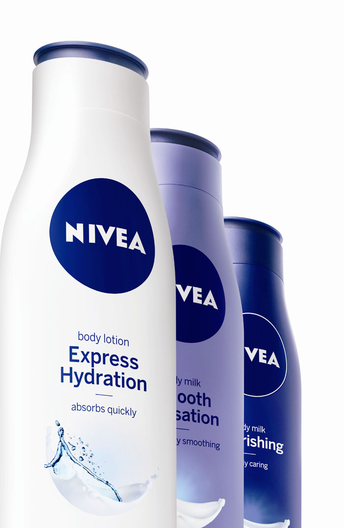
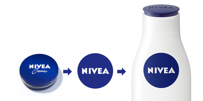
The blue NIVEA tin wasn’t just the basis of the design, but also a source of inspiration to the designers. The crème tin is used as a logo, reflected in the rounded contours of the new packagings and in the reduced blue and white colors of the new design. The round lid, which tilts towards the consumer, embossed with the NIVEA logo, has obvious similarities with the iconic blue tin and it provides customers with a “familiar face” on the shelf.
“Design is important because it adds value to an object‟s function,” said Béhar. The multiple award-winning industrial designer is committed to “developing products that aren‟t just functional, but which also enhance the consumer experience and appeal to their emotions‟. Unlike many other skin care brands, NIVEA isn‟t geared to a specific culture, gender or age group. I was particularly drawn to this design project by the vast emotional potential of the NIVEA brand and its 100-year heritage,” continued Béhar.
The first consumer tests confirm that the development team‟s efforts were worthwhile because consumers – especially in the growth markets of Asia and South America – rated the new design line as very good.
Designed by Fuse Project, San Francisco


